Visualization I
Objectives
- Recognize the basics of
matplotlibfigure elements. - Create a basic line plot, add labels, and grid lines to the plot.
- Plot multiple series of data.
- Plot
imshow,contour, and filled contour (contourf) plots. - Introduction to
cartopyand making maps.
Getting started with matplotlib
Use a magic function
to set the backend of matplotlib to the ‘inline’ backend. This makes the matplotlib plots appear inline as images.
Import matplotlib’s pyplot interface as well as numpy.
%matplotlib inline
Import matplotlib’s pyplot interface as well as numpy.
import matplotlib.pyplot as plt
import numpy as np
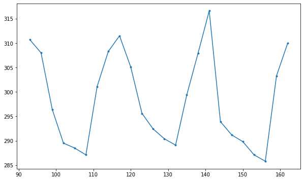
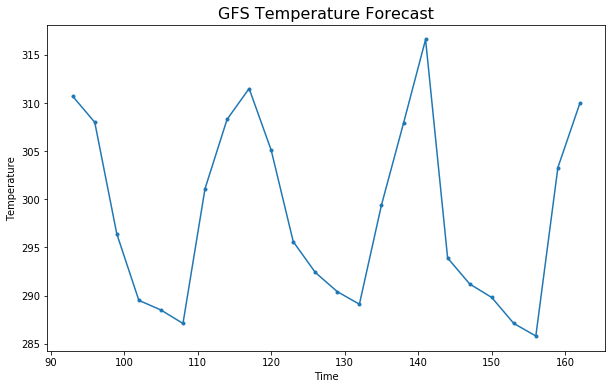
Generate some data to use while experimenting with plotting:
times = np.array([ 93.,  96.,  99., 102., 105., 108., 111., 114., 117.,
                  120., 123., 126., 129., 132., 135., 138., 141., 144.,
                  147., 150., 153., 156., 159., 162.])
temps = np.array([310.7, 308.0, 296.4, 289.5, 288.5, 287.1, 301.1, 308.3,
                  311.5, 305.1, 295.6, 292.4, 290.4, 289.1, 299.4, 307.9,
                  316.6, 293.9, 291.2, 289.8, 287.1, 285.8, 303.3, 310.])
Create a figure
fig = plt.figure(figsize=(10, 6))

# get the first axis in a 1x1 grid of axes
ax = fig.add_subplot(1, 1, 1) #nrows=1, ncols=1, index=1)

# Plot a dotted line with x=time and y=temps
ax.plot(times, temps, '.-')
Add some labels to the plot
ax.set_xlabel('Time')
ax.set_ylabel('Temperature')

# add a title
ax.set_title('GFS Temperature Forecast', fontdict={'size': 16})

# Prompt the notebook to re-display the figure after we modify it
fig
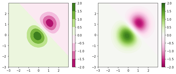
imshow/contour
imshowdisplays the values in an array as colored pixels, similar to a heat map.contourcreates contours around data.contourfcreates filled contours around data.
First let’s create some fake data to work with - let’s use a bivariate normal distribution.
x = y = np.arange(-3.0, 3.0, 0.025)
X, Y = np.meshgrid(x, y)
Z1 = np.exp(-X**2 - Y**2)
Z2 = np.exp(-(X - 1)**2 - (Y - 1)**2)
Z = (Z1 - Z2) * 2
Create a filled contour plot
The cmap argument specifies the
colormap
to use. We can also specify the contour levels.
fig = plt.figure(figsize=(10, 4))

dz = 0.5
ax = fig.add_subplot(1, 2, 1)
c1 = ax.contourf(X, Y, Z, cmap='PiYG', levels=np.arange(-2., 2+dz, dz))
plt.colorbar(c1)

dz = 0.1
ax = fig.add_subplot(1, 2, 2)
c2 = ax.contourf(X, Y, Z, cmap='PiYG', levels=np.arange(-2., 2+dz, dz))
plt.colorbar(c2)