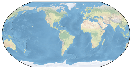
Getting started with cartopy
%matplotlib inline
import matplotlib.pyplot as plt
import numpy as np
import cartopy
import cartopy.crs as ccrs

# use matplotlib's built-in transform support, same function calls
fig = plt.figure(figsize=(10, 4))
axm = fig.add_subplot(1, 1, 1, projection=ccrs.Robinson(central_longitude=300.))

# set the extent to global
axm.set_global()

# add standard background map
axm.stock_img()
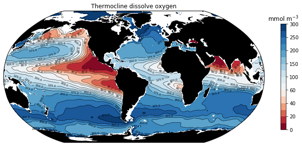
Plotting a global contour map
Load a dataset of dissolved oxygen concentration in the thermocline (400-600 m depth).
import xarray as xr
ds = xr.open_dataset('data/woa2013v2-O2-thermocline-ann.nc')
ds
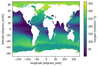
Use xarray’s hooks to matplotlib to create a quick-look plot
ds.O2.plot();
Colormap normalization
- Objects that use colormaps by default linearly map the colors in the colormap from data values vmin to vmax.
- Colormap normalization provides a means of manipulating the mapping.
For instance:
import matplotlib.colors as colors
norm = colors.Normalize(vmin=-1, vmax=1.)
norm(0.)
We can map data to colormaps in a non-linear fashion using other normalizations, for example:
norm = colors.LogNorm(vmin=1e-2, vmax=1e2)
np.array(norm([0.01, 0.1, 1., 10., 100.]))
…back to oxygen
Set contour levels to non-uniform intervals and make the colormap centered at the hypoxic threshold using DivergingNorm.
levels = [0, 10, 20,  30, 40, 50, 60, 80, 100, 125, 150, 175, 200, 225,
          250, 275, 300]

norm = colors.DivergingNorm(vmin=levels[0], vmax=levels[-1], vcenter=60.)
Add a cyclic point to accomodate the periodic domain.
from cartopy.util import add_cyclic_point
field, lon = add_cyclic_point(ds.O2, coord=ds.lon)
lat = ds.lat
Putting it all together…
fig = plt.figure(figsize=(12, 8))
ax = fig.add_subplot(1, 1, 1, projection=ccrs.Robinson(central_longitude=305.0))

# filled contours
cf = ax.contourf(lon, lat, field, levels=levels, norm=norm, cmap='RdBu',
                 transform=ccrs.PlateCarree());

# contour lines
cs = ax.contour(lon, lat, field, colors='k', levels=levels, linewidths=0.5,
                transform=ccrs.PlateCarree())

# add contour labels
lb = plt.clabel(cs, fontsize=6, inline=True, fmt='%r');

# land
land = ax.add_feature(
    cartopy.feature.NaturalEarthFeature('physical','land','110m', facecolor='black'))

# colorbar and labels
cb = plt.colorbar(cf, shrink=0.5)
cb.ax.set_title('mmol m$^{-3}$')
ax.set_title('Thermocline dissolve oxygen');