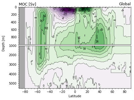
Example: contour plot with colors and labeled lines
In this example, we’ll plot the Meridional Overturning (MOC) streamfunction from the CESM-POP ocean component model.
%matplotlib inline
import xarray as xr
import numpy as np
import matplotlib.pyplot as plt
Load the dataset
ds = xr.open_zarr('../data/moc.zarr')
ds
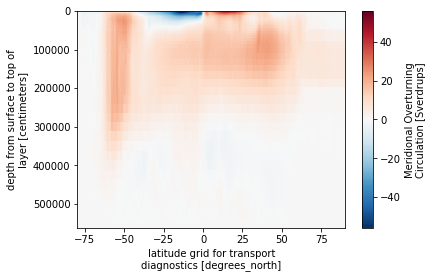
Make a “quick-look” plot
Use the xarray plot method to take a quick look at the data.
h = ds.MOC.plot(yincrease=False)
Make a publication-quality plot
Set the contour levels.
lo = -40.
hi = 40.
dc = 4.
cnlevels = np.arange(lo, hi+dc, dc)
cnlevels
Generate the figure
Create a two-panel plot with refined resolution in the upper ocean.
# create a figure object
fig = plt.figure(figsize=(7.2, 4.8))

# add two axes
ax1 = fig.add_axes([0.1, 0.51, 0.7, 0.35]) # top 1000 m
ax2 = fig.add_axes([0.1, 0.1, 0.7, 0.4]) # deep ocean

# set the background color where
ax1.set_facecolor('darkgray')
ax2.set_facecolor('darkgray')

# plot the field by looping over axes
cs = [None]*2 # dimension lists
mesh = [None]*2
for i, ax in enumerate([ax1, ax2]):
    # contour lines
    cs[i] = ax.contour(ds.lat_aux_grid, ds.moc_z*1e-2, ds.MOC,
                       colors='k',
                       linewidths=0.5,
                       levels=cnlevels)

    # contour colors
    mesh[i] = ax.contourf(ds.lat_aux_grid, ds.moc_z*1e-2, ds.MOC,
                          levels=cnlevels,
                          cmap='PRGn',
                          extend='both')

# set axis limits, note the reversed limits reverse the y-axis
ax1.set_ylim([1000., 0.])
ax2.set_ylim([5500., 1000.])
ax1.set_xlim([-90, 90])
ax2.set_xlim([-90, 90])

# add contour line labels after axis limits have been set
for csi in cs:
    lb = plt.clabel(csi, fontsize=8, inline=True, fmt='%.0f')

# set tick properties top axis
ax1.set_xticklabels([])
ax1.set_yticklabels(np.arange(0, 1000, 200))
ax1.minorticks_on()
ax1.xaxis.set_ticks_position('top')

# set tick properties bottom axis
ax2.minorticks_on()
ax2.set_xlabel('Latitude')
ax2.xaxis.set_ticks_position('bottom')

# axis label
ax2.set_ylabel('Depth [m]')
ax2.yaxis.set_label_coords(-0.12, 1.05)

# title
ax1.set_title('MOC [Sv]',loc='left')
ax1.set_title('Global',loc='right');
Save figure to file
fig.savefig('moc-plot.png', dpi=300, bbox_inches='tight')